
Your Design Looks Great. But Does It Work?
Most creative decisions still come down to gut feel. The EyeQuant Unified Score closes the gap.
A designer tweaks the hero image until it feels right. A marketer argues for a different CTA because it seems stronger. A stakeholder asks for a brighter colour because it looks more exciting. Everybody has an opinion, and the meeting runs long, and the design ships, and nobody actually knows if it works.
A/B tests can tell you, eventually. After weeks of traffic, statistical significance, and a result that only applies to that design, on that page, in thatcontext. By then you’re three versions further on.
Heatmaps are powerful, but cryptic. Five overlapping maps showing where eyes go, what registers, what pops — they’re data-rich and interpretation-poor. Knowing that attention concentrates in the top-left doesn’t tell you whether that’s good or bad for what you’re trying to do.
There’s a gap between “looks good” and “works.” The EyeQuant Unified Score closes it.
What Is the Unified Score?
The Unified Score is a single 0–100 grade for any visual creative — landing page, social ad, product screen, email header — that reflects how well it performs across five dimensions that matter to real users.
It’s not a style score. It’s not an accessibility check. It’s not someone’s opinion dressed up as a number.
It’s built on EyeQuant’s visual attention models — the same neuroscience-backed technology used by enterprise design and marketing teams to predict where human eyes go before a single user sees the design. Those models have been trained on millions of data points from eye-tracking studies. They don’t guess at attention; they predict it with measurable accuracy.
The Unified Score takes that attention data and interprets it: not just where eyes go, but what that meansfor your specific design and what it’s trying to accomplish.
The answer to “how well does this design actually perform?” is grounded in attention data, not opinion.
The Five Dimensions
Every design is trying to answer five questions. The Unified Score measures how well yours answers each of them.
| Dimension | The question your design needs to answer |
|---|---|
| Message Clarity | Can users quickly understand what this is and why it matters? |
| Focus & Guidance | Does the design lead the eye where it needs to go? |
| First-3-Seconds Readiness | Is the immediate impression strong enough to stop the scroll? |
| Cognitive Load | Is the design asking too much of users at once? |
| Goal Fit | Does the design actually do what it’s supposed to do? |
Why Intent Changes Everything
A social ad and a checkout page are not trying to accomplish the same thing. They shouldn’t be scored the same way.
The Unified Score is intent-aware. When you tell it what the creative is trying to do, the scoring weights shift to reflect what actually matters for that goal.
Stop scroll (social ads, top-of-funnel creative): First-3-Seconds Readiness and Focus carry the most weight. The design has roughly one second to earn attention in a feed. A busy layout that would be perfectly acceptable on a product page is fatal here.
Reassure trust(checkout flows, signup pages, onboarding): Comprehension and Cognitive Load dominate. At this stage, users are deciding whether to commit. Anything that creates hesitation — visual clutter, unclear hierarchy, a CTA that doesn’t feel earned — shows up as a penalty in the score.
Convert (landing pages, campaign pages): Comprehension and Focus share the weight equally. The design needs to land the message clearly and guide the eye to the CTA without friction.
Inform fast(announcements, product updates, newsletters): Comprehension gets the highest weight. Users are scanning for a specific answer. The design’s job is to make that answer obvious as quickly as possible.
This is the key difference between the Unified Score and a generic design grade. Two identical-looking scores on two different designs can represent completely different situations, because what “good” means depends on what you’re trying to do.
What You Actually Get Back
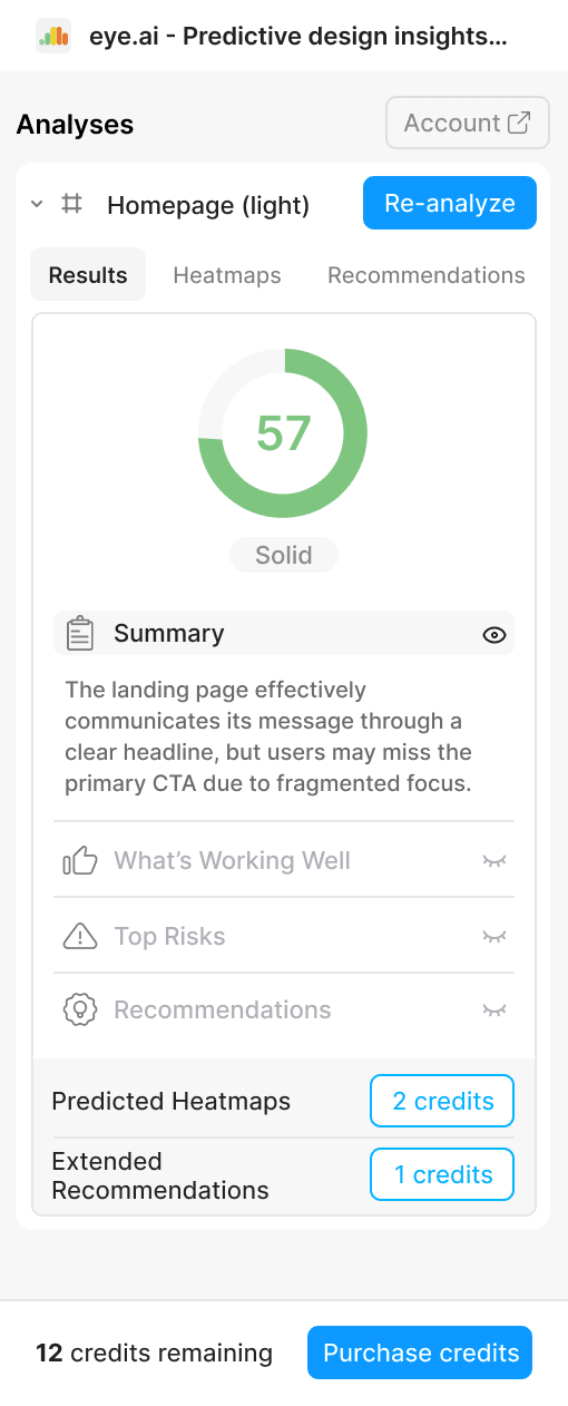
The score is 0–100 with a band: Needs work, Solid, Strong, or Excellent. But the number is the least important part of the output.
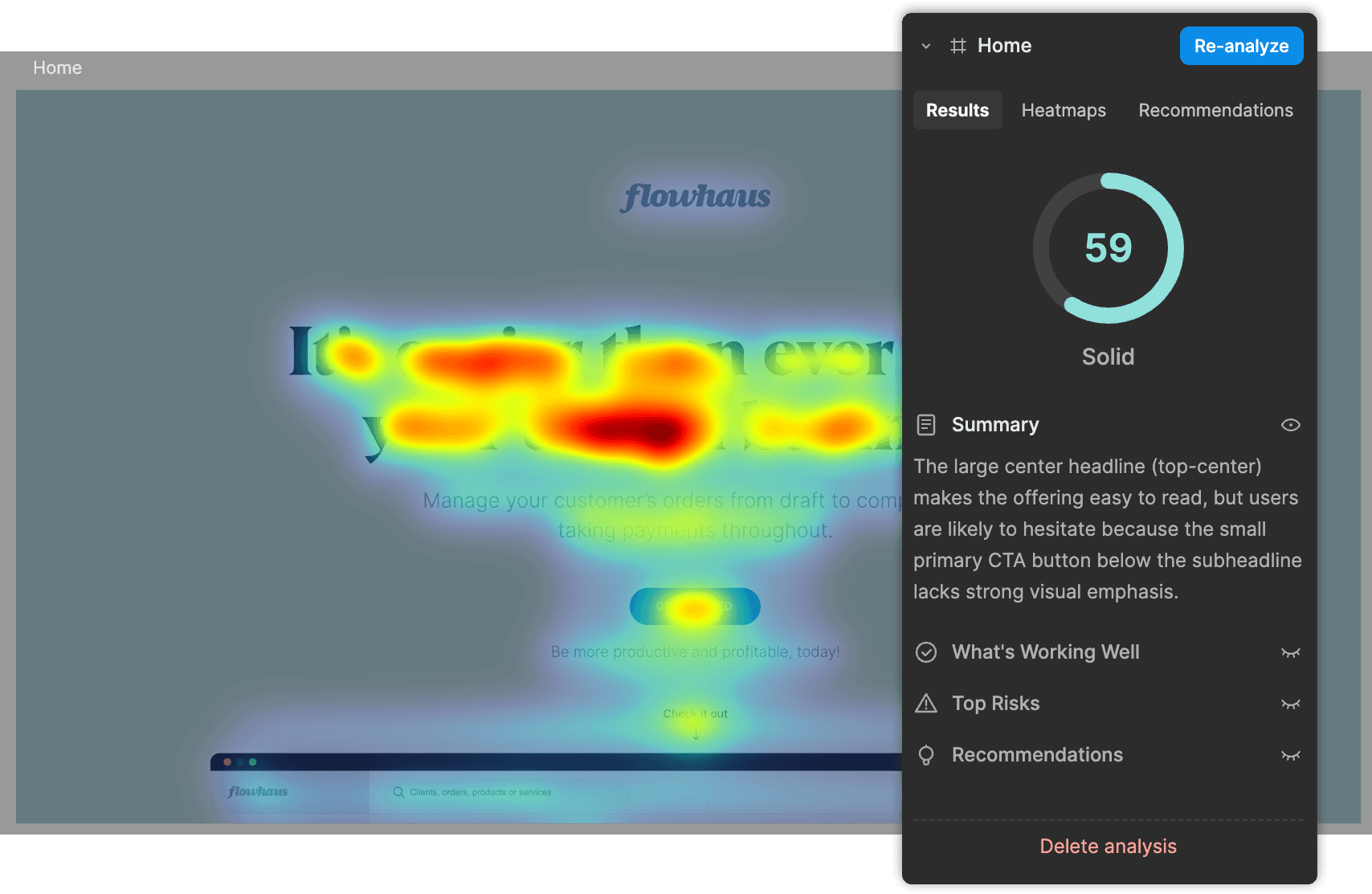
One-sentence verdict.A single sentence that summarises overall performance and identifies the primary limiting factor, grounded in a specific element you can see. Not “attention distribution is suboptimal” but “the hero image draws strong early attention, but the primary CTA in the lower-right is consistently missed before users scroll away.”
What’s working well.Up to three observations of things the design is genuinely doing right, each tied to a concrete visual element and describing a user behaviour. “The headline at the top-centre registers before any other element, giving users an immediate frame for the page” tells you something you can preserve when iterating.
Top 3 risks.Each risk is framed as a user failure mode — what users will actually do, not an abstract design problem. “Users hesitate at the form field because the value proposition in the subheadline hasn’t registered yet” tells you both the symptom and the likely cause.
3 recommendations.Each recommendation addresses one of the listed risks directly. It tells you what element to change, specifically how to change it, and what user behaviour should improve as a result. “Move the pricing block from below the fold to directly beneath the headline, so users see cost in the context of the benefit rather than after it” is a recommendation you can act on this afternoon.
Everything is anchored to something visible. No generic advice, no abstract principles, nothing that couldn’t have been written without looking at your specific design.
Why We Think This Matters
Design decisions have always been made with imperfect information. Opinion, intuition, and experience are valuable, but they’re slow to align, hard to share, and impossible to track across iterations.
The Unified Score changes the timeline. A designer can validate a layout decision in the time it takes to make a coffee. A marketer can compare two creative directions before a brief goes to production. A team lead can bring a score to a review instead of a personal opinion.
The score travels with the design. Share it in a review. Present it to a client. Run it again after changes and track the delta. Build a history of what worked and why.
And it happens at the moment of design — not after launch, not after an A/B test has run for three weeks, not after a usability session has been scheduled, recruited, and analysed. In Figma, on the design you’re working on right now.
Attention science isn’t new. EyeQuant has been applying it at the enterprise level for years. What’s new is having it available at design-time, automatically, without a research team or a specialist to interpret the results.
The gap between “looks good” and “works” has always existed. Now you have a way to measure it.
See It on Your Own Design
Reading about a score is one thing. Seeing it on something you actually made is another.
Run your first analysis free at eye.ai. No setup, no credit card — simply upload a design, set your intent, and get your Unified Score in seconds.